

Flexbox :
Flexbox is used to make a modern UI in an easy way. it is super lightweight to make create a responsive way very easily. flexbox provides different properties like gap, align-items, etc. it making designing for responsive screen sizes painless.
flexbox was designed as a one-dimensional layout model, and as a method that could offer space distribution between items in an interface and powerful alignment capabilities.
Flexbox Terminology :
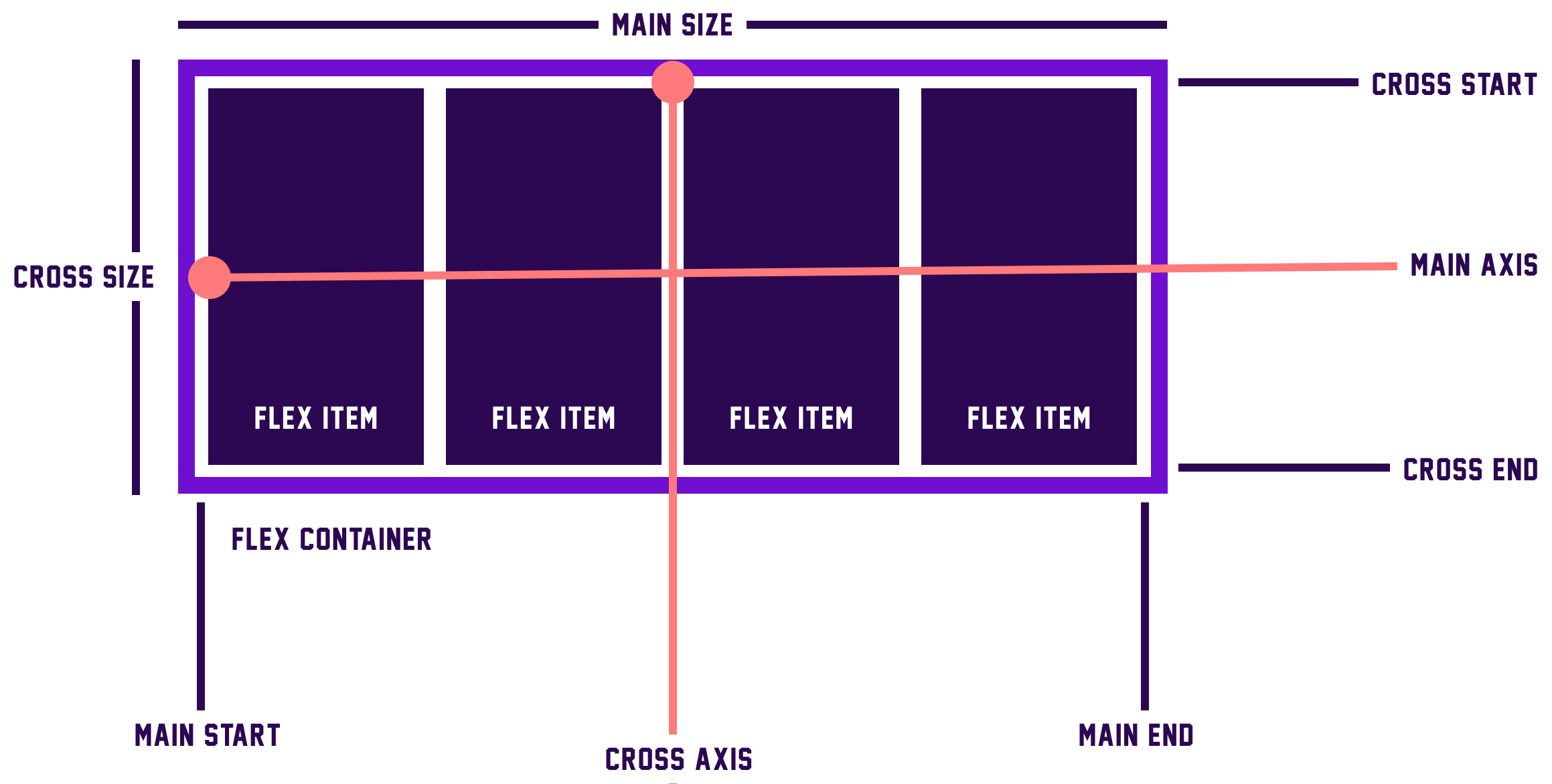
Flexbox has two different axes one is the Main axis and the second is the Cross axis.
Main axis :
This axis is the primary axis of a Flex Container and this is depending upon the value of a flex-direction.
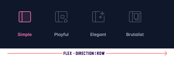
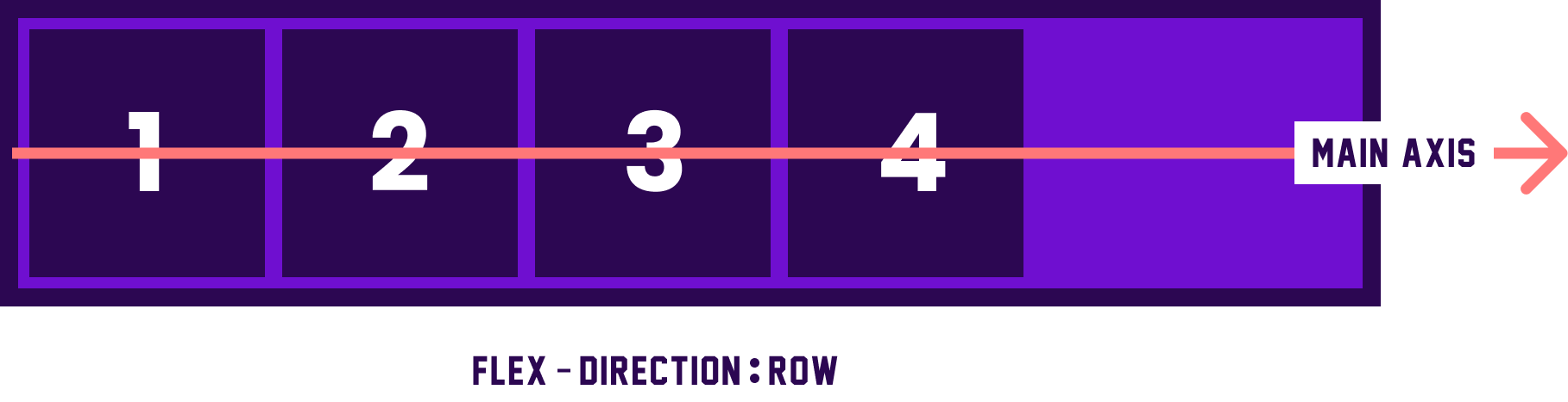
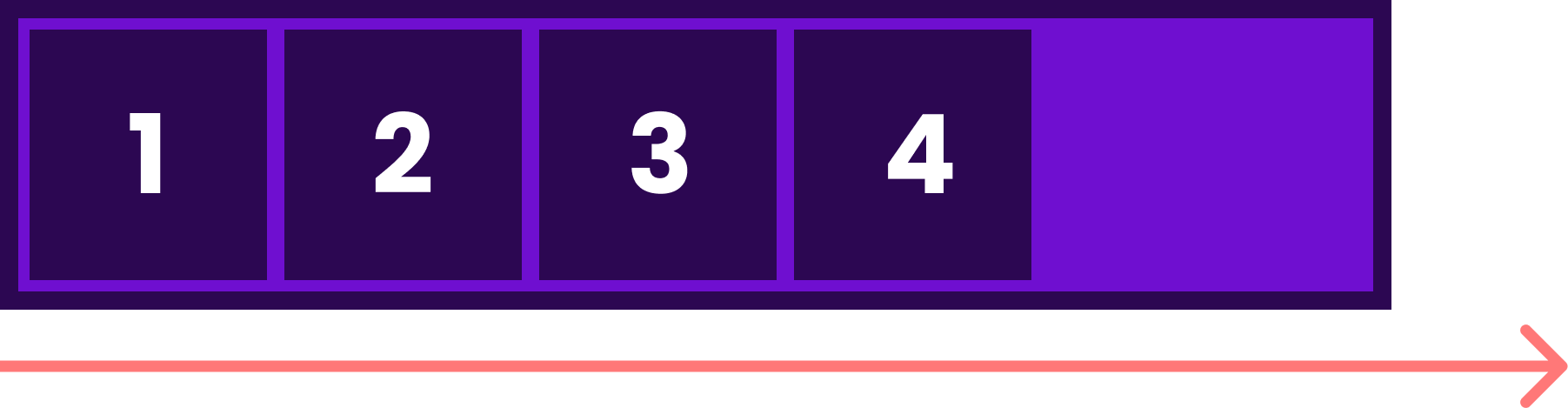
If the flex-direction:row and flex-direction:row-reverse the main axis is horizontal in the below figure you understand very easily.
Main axis will run from the top of the page to the bottom — in the block direction.
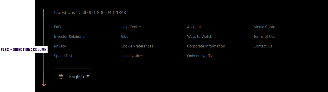
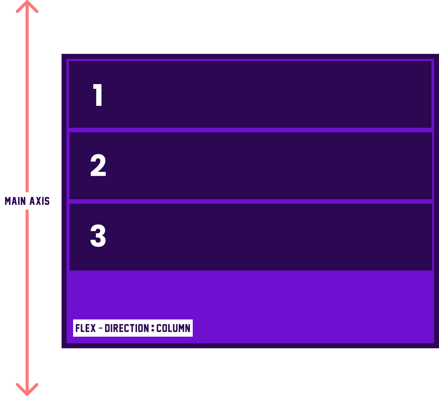
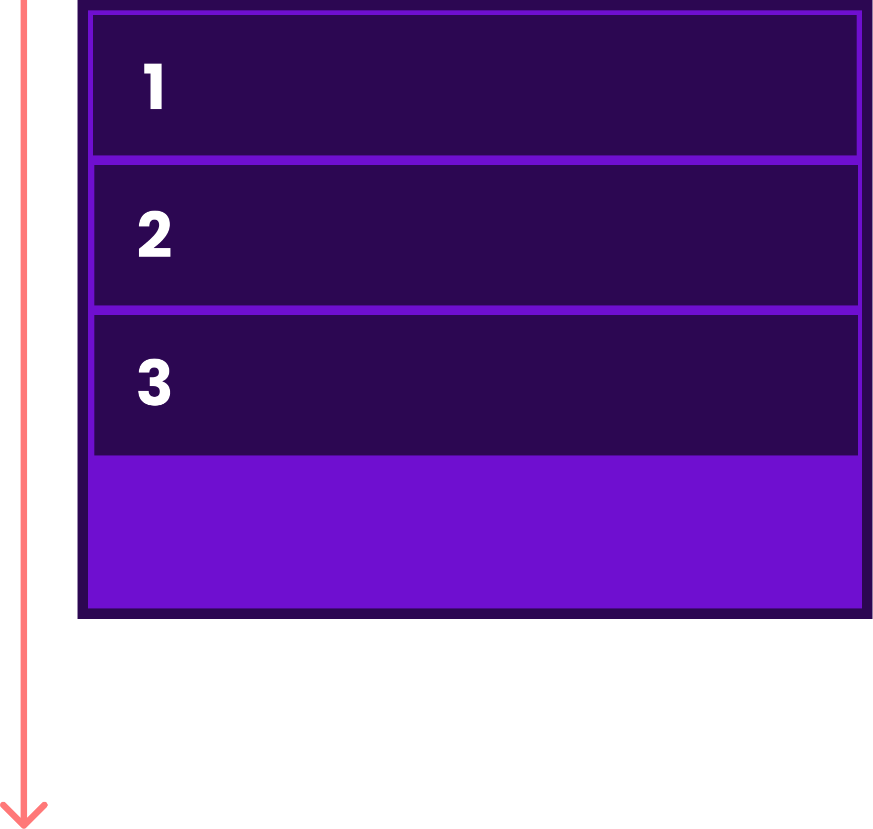
If the flex-direction:column and flex-direction:column-reverse the main axis is vertical in the below figure you understand very easily.
Main axis will run along the row in the inline direction.
Main-start and Main-end :
Flex items are placed within a container beginning at the main start and resting at the main end. you can see the above diagram.
Main size :
A flex item’s width or height is the main size and it depends upon which is the main direction. The main size property will either be ‘width’ or ‘height’.
Cross axis :
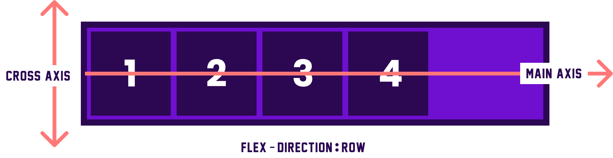
This axis is perpendicular to the main axis and it depends on the main axis's direction. therefore if your flex-direction (main axis) is set to row or row-reverse the cross-axis runs down the columns which means it is perpendicular to the main axis and runs top to bottom.
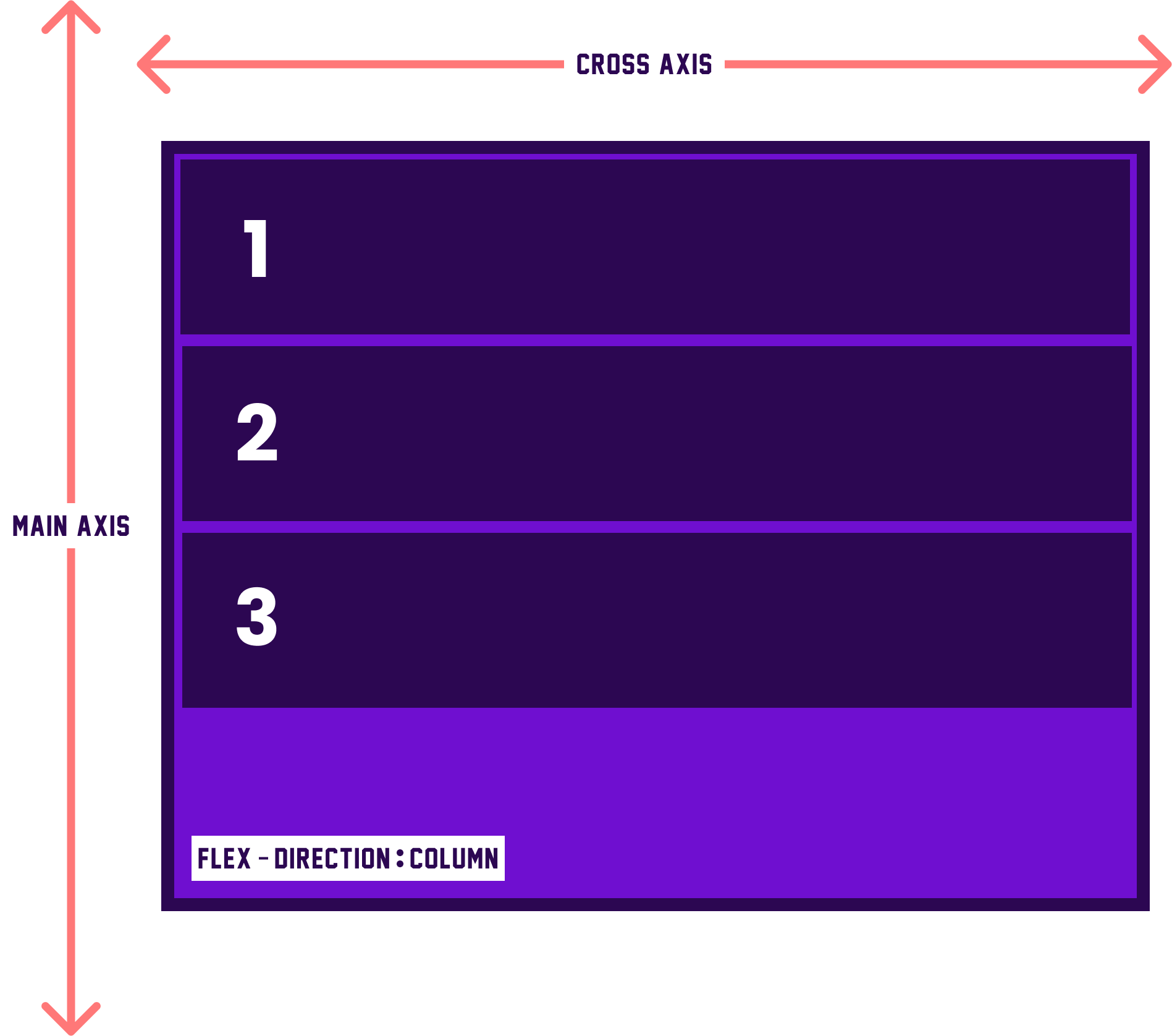
If your main axis is column or column-reverse then the cross axis runs along the rows.
Cross start and Cross end :
Items are placed beginning at the cross-start side of the flex container and moving towards the cross-end side.
Cross size :
The width or height of a flex item, which again depends on the main direction. This property will be either ‘width’ or ‘height’.
Flex Container Properties :
An area of a flexbox is called a flex container and when we create a flex container then we set the value display:flex and the direct children of that container become flex items.
.box{
  display:flex;
}
Flex Direction :
This property allows changing the direction of the flex items.
Syntax : flex-direction:value;
there are 4 values present in the flex-direction.
- row
flex-direction:row;
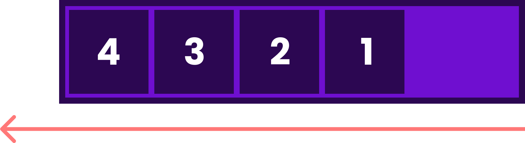
- row-reverse
flex-direction:row-reverse;
- column
flex-direction:column;
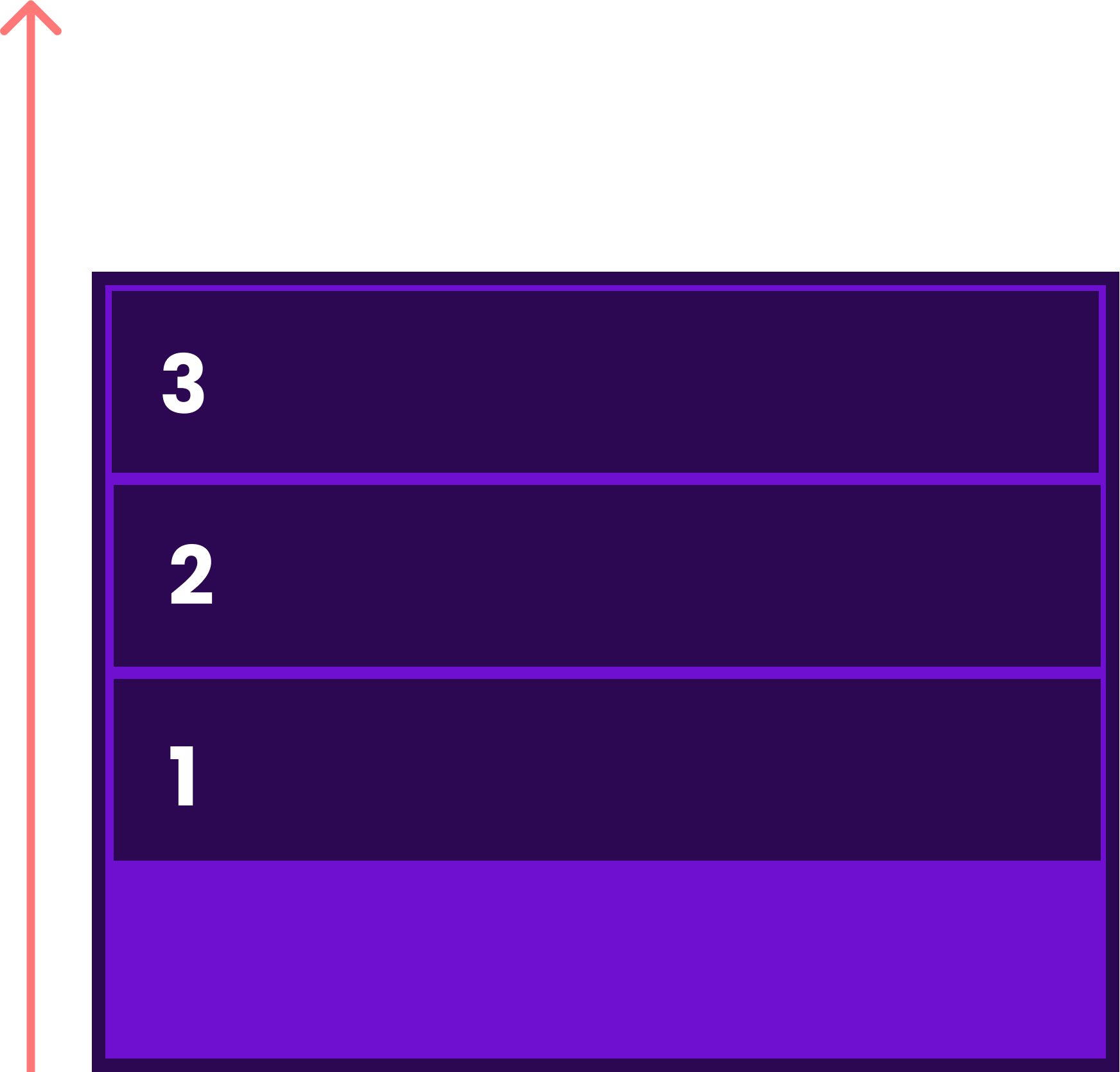
- column-reverse
flex-direction:column-reverse;
Flex-direction is a very useful property and it is usually used in many websites or pages example in the below pages :